
Color Palettes That Calm the Aging Brain According to Neuroscience
- CoCo Design

- Sep 22, 2025
- 4 min read
As we age, our brains experience changes that can impact mood, cognition, and mental well-being. One intriguing area of research is how color influences our emotions and mental states. Neuroscience reveals that certain color palettes can have calming effects, especially for the aging brain. This post dives into the science of color perception and provides practical insights on which color palettes can enhance the mental health of older adults.
The Science of Color and Emotion:Calming Color Palettes for Aging Brain
Color is more than a visual experience; it profoundly shapes our feelings and actions. Color psychology explores how different hues influence our emotions. For older adults who may face increased anxiety or stress from life changes, understanding the soothing effects of color is especially important.Calming Color Palettes for Aging Brain
Research shows that colors can trigger specific emotional responses. For example, warm colors like red and orange can boost energy, while cool colors like blue and green typically promote calmness. A study published in the journal Environmental Psychology found that environments featuring cool colors can lower stress levels by up to 20%. This finding highlights the benefits of creating peaceful surroundings for the aging brain to reduce anxiety and foster tranquility.

Calming Color Palettes for the Aging Brain: Warms Natural
1. Soft Blues and Greens
Soft blues and greens evoke feelings of nature and tranquility. These colors cultivate peace, making them great choices for spaces where older adults spend their time. Incorporating these hues into home decor—such as wall colors, furniture, or accessories—can create a soothing environment that encourages relaxation.
For example, a study by the American Psychological Association found that blue light exposure can significantly help regulate sleep patterns, crucial for cognitive function in older adults. Similarly, green is linked to renewal and growth, creating a positive mental atmosphere. One practical application is painting bedrooms in soft blue tones to promote better sleep.
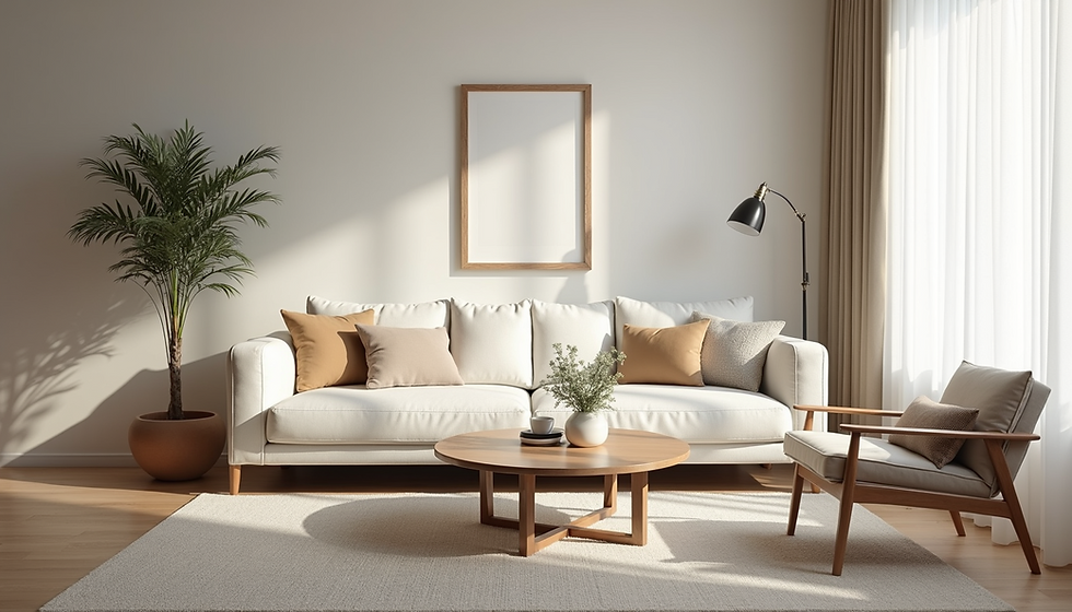
2. Warm Neutrals
Warm neutrals like beige, taupe, and soft browns create cozy atmospheres. These colors are less stimulating than bright hues, making them effective for calming environments. Studies have demonstrated that warm neutral tones can reduce feelings of anxiety by about 15%, creating a sense of stability and comfort.
When incorporating warm neutrals, consider using them for paint, textiles, and furniture. A room with warm beige walls and soft brown furniture can enhance natural light, making the space feel more open and airy. This openness is beneficial for mental well-being and can help older adults feel less confined.

3. Pastel Shades
Pastels such as soft pinks, lavenders, and light yellows evoke nostalgia and warmth. These gentle hues are less overwhelming than brighter colors and can create a calming atmosphere. In spaces where older adults engage in activities like reading, crafting, or socializing, pastel shades can foster a sense of comfort.
Research shows that pastel colors can stimulate positive emotions and memories. For instance, incorporating soft pink accents in a reading room can recall joyful memories, contributing to cognitive health. Hang pastel artwork or choose decorative items in these shades to enhance the space’s emotional connection.
Practical Tips for Implementing Calming Color Palettes
Assess the Environment
Before making changes, take stock of the current environment. Evaluate existing color schemes and their emotional impact. Identify areas needing a calming touch and plan your approach.
Choose the Right Shades
Select softer, muted tones instead of bright, saturated colors. When painting, test samples on walls to see how they look in various lighting throughout the day. This helps ensure the chosen shades promote the desired mood.
Incorporate Textures
Textures can enhance the calming effect of colors. Soft fabrics, natural materials, and layered textiles—like cushioned throws or rugs—can create an inviting atmosphere. Consider using textured items in your color palette to add depth and comfort.
Personalize the Space
Add personal items that resonate with the individual’s history and preferences. Family photos, meaningful artwork, or cherished mementos can evoke positive memories. This personalization helps create a more comforting environment.
Create Zones
If possible, structure the space into different zones using color. For instance, paint a reading nook soft blue for relaxation, while a social area can use warm neutrals for comfort. This zoning helps define areas for specific activities, enhancing a sense of purpose and calm.
Enhancing Well-Being through Thoughtful Color Choices
Recognizing the impact of color on the aging brain is a valuable tool for improving mental well-being. By implementing calming color palettes such as soft blues, warm neutrals, and pastel shades, we can foster relaxation and peace.
As we age, our surroundings significantly influence our emotional health. Thoughtfully selecting soothing colors can improve the quality of life for older adults. Whether through home decor or personal spaces, the right color palette can create a nurturing environment.
Incorporating these insights into daily life can lead to a more serene and fulfilling experience for the aging brain, ultimately enhancing overall well-being.


Comments